Summarize and analyze this article with
Your weekly sales performance review is underway. A key metric is off—way off. Leadership wants answers, analysts are digging through pipelines, and the data team is under pressure. Sound familiar? In most cases, the root problem is a lack of visibility into data quality.
Your organization needs data quality dashboards. These dashboards provide a real-time, centralized view of your data’s health across systems, pipelines, and teams. From tracking accuracy and completeness to surfacing anomalies and patterns, they give everyone—from data engineers to business leaders—the clarity needed to trust the data and take action.
In this blog, we’ll explore different types of data quality dashboards, key considerations for building them, and how DQLabs helps you shift from reactive data firefighting to proactive data reliability and
Types of Data Quality Dashboards
Not all data quality dashboards are created equal. Depending on your focus and audience, you might implement different types of dashboards to cover various aspects of data quality. Here are some common types of data quality dashboards, each serving a unique purpose:
Dimension-Focused Data Quality Dashboards
These track core quality dimensions like completeness, accuracy, timeliness, consistency, validity, and uniqueness across datasets. You might see accuracy scores by domain or system, giving a comprehensive, at-a-glance view of overall data health and highlighting areas that need attention.
Critical Data Element (CDE) Dashboards
CDE dashboards focus on the most impactful data fields—like “total revenue” or “customer email.” They monitor quality metrics such as missing values or invalid entries for these fields to ensure that critical data used in key business decisions remains trustworthy and clean.
Business Goal-Oriented Dashboards
These dashboards align data quality with specific KPIs or business goals—like revenue growth, churn reduction, or compliance. For example, tracking the accuracy of customer data alongside retention metrics shows how data quality influences performance outcomes.
Data Source-Focused Dashboards
These dashboards organize quality metrics by source system—like CRM, ERP, or data warehouse—and highlight which pipelines are contributing the most issues. They help engineering teams zero in on problematic sources and fix quality issues where they originate.
Data Consumer-Centric Dashboards
Tailored for specific departments (Marketing, Finance, Data Science, etc.), these dashboards highlight the quality of data each group depends on. Giving teams visibility into their data’s fitness builds trust and promotes shared ownership of data quality across the org.
Data Quality Issue Tracking Dashboards
Focused on monitoring data quality issues over time, these dashboards show open issues, resolution timelines, and trends. Often integrated with ticketing tools, they ensure that quality problems are prioritized, tracked, and resolved in a structured, ongoing process.

What to Consider When Building a Data Quality Dashboard
Building an effective data quality dashboard requires careful planning. Keep these factors in mind during the design and setup phase:
Key Data Quality Metrics: Identify which metrics best reflect the health of your data. Common dimensions include accuracy, completeness, consistency, timeliness, validity, and uniqueness. Define what “good” looks like for each—for instance, is 98% completeness enough, or do you need 99.9%? Consider domain-specific indicators too—like deliverable addresses for customer data. Setting clear targets up front ensures your dashboard focuses on what matters most to the business.
Tools and Platform: Decide how you’ll implement the dashboard. While BI tools or custom reports may work, they can be manual and siloed. Consider dedicated platforms like DQLabs that offer built-in dashboards and automated monitoring. These tools reduce the effort of gathering metrics and keeping the dashboard current. Look for features like seamless integration with your data sources, real-time or scheduled refreshes, and dashboard customization.
Stakeholders and Access: Consider who will use the dashboard and how they’ll access it. It should be intuitive and relevant for all stakeholders—data engineers, analysts, stewards, or executives. Decide whether you’ll use one central dashboard with filters or multiple tailored ones. Include explanations or tooltips for complex metrics so even non-technical users can interpret the data. Easy, broad access is essential to ensure the dashboard drives real action.
By considering metrics, platform, and audience needs before you start building, you’ll lay a strong foundation for a dashboard that is both useful and sustainable.
Best Practices for Designing Effective Data Quality Dashboards
Designing a dashboard isn’t just about what to show, but how to present it in a way that drives action. Here are key practices to follow:
1. Define Clear Objectives and KPIs
Start with a clear purpose. What decisions or actions should the dashboard inform? Set a few targeted KPIs—like reducing missing data in critical fields or improving trust scores. Clear goals help tailor content to what stakeholders truly need and prevent the dashboard from becoming cluttered with irrelevant metrics.
2. Involve Stakeholders Early
Data quality touches many roles, so involve stakeholders early. Talk to data engineers, analysts, stewards, and executives to understand what matters to each. Finance might prioritize accuracy in records, while marketing may care more about deduplication. Early input ensures relevance, builds trust, and increases adoption.
3. Integrate Data from All Relevant Sources
Avoid silos by pulling data quality metrics from across your systems—whether lakes, warehouses, or broader data fabrics. A unified view allows teams to spot cross-system patterns (e.g. a CRM glitch impacting completeness downstream). Platforms like DQLabs help by consolidating metrics across sources, making your dashboard a central truth.
4. Design for Clarity and Usability
The dashboard should be intuitive and scannable. Keep layouts clean, use clear labels, and highlight the most important KPIs. Avoid clutter—every chart should serve a purpose. Use color-coding smartly (e.g. red/yellow/green alerts), and add filters or drill-downs so users can explore by team or time range. For non-technical users, include tooltips or legends with metric definitions to improve understanding.
5. Automate Monitoring and Alerts
Keep dashboards current with scheduled refreshes—daily, hourly, or real-time. Set up automated alerts when key thresholds are breached (e.g. completeness drops below 95%). These alerts, sent via email or chat, help teams act fast. Most platforms let you configure these easily. This turns your dashboard into a 24/7 monitoring tool that flags issues proactively.
6. Continuously Refine and Improve
Treat the dashboard as a living tool. As business goals or data sources evolve, update it accordingly. Gather feedback—what’s useful, what’s missing, what’s unused? Review it quarterly to remove clutter, update targets, or add new metrics. This ongoing refinement keeps the dashboard relevant and supports a culture of continuous quality improvement.
The Purpose of Data Quality Dashboards
A data quality dashboard provides a clear, shared view of your organization’s data health. Instead of guessing or relying on scattered reports, teams can quickly assess the status of key metrics like completeness, accuracy, or timeliness in one place. This visibility builds trust and helps everyone—from data engineers to executives—make better, data-driven decisions.
Dashboards also act as early-warning systems by flagging anomalies, errors, or sudden drops in data quality before they escalate into bigger issues. By spotting problems early, teams can take action proactively—reducing rework, avoiding bad insights, and saving time.
Beyond monitoring, dashboards drive accountability. When metrics and goals are visible, teams are more motivated to improve. It becomes easier to track progress, celebrate wins, and align data quality efforts with business outcomes.
How to Use Data Quality Dashboards for Effective Monitoring
Establish Data Quality Checks and Metrics
Start by defining the rules you want to monitor—completeness, accuracy, validity, and more. Set clear thresholds for what’s acceptable. These checks serve as the foundation of your dashboard and help ensure you’re tracking the right indicators.
Connect and Configure the Dashboard
Link your dashboard to the checks you’ve set up. Prioritize key metrics and add filters like date range or data source for quick insights. Ensure the dashboard refreshes on a schedule or in real time to keep it accurate and actionable.
Regularly Review and Interpret the Results
Make dashboard checks part of your routine—quick daily scans and deeper weekly reviews. Watch for trends or anomalies, and use drill-downs to find the source of any changes. Context matters, so interpret results with the bigger picture in mind.
Investigate and Address Issues Promptly
When issues appear, act fast. Assign a team member to identify the root cause and fix both the data and the underlying process. Documenting fixes ensures knowledge is preserved and helps prevent future issues.
Automate Alerts and Workflows
Set up alerts for when metrics fall below thresholds. Trigger workflows like ticket creation or escalations to ensure nothing gets missed. Automation ensures timely responses and smoother monitoring across teams.
By integrating these steps into your routine, your dashboard becomes a real-time command center for maintaining high data quality—reducing surprises and building trust in your data.
Turning Data Quality Insights into Action
The real power of a data quality dashboard lies in what you do with it. Rather than just surfacing metrics, it highlights where action is needed most—like missing values in high-impact areas or a sudden drop in data completeness. With platforms like DQLabs, these insights are enriched with business context and next-step recommendations, making it easy for teams to focus on what matters and act faster.
Beyond just identifying problems, intelligent dashboards help detect recurring patterns, trigger alerts, and even automate responses. For example, if a data feed fails a validity check, DQLabs can notify the right steward, open a ticket, and trigger a cleanup job—all in real time. This closed-loop approach transforms your dashboard into a decision-making and remediation hub, reducing manual effort and helping maintain consistently high-quality, trusted data.
Real-World Data Quality Dashboard Examples (DQLabs in Action)
Case Study 1: Waste Management Company
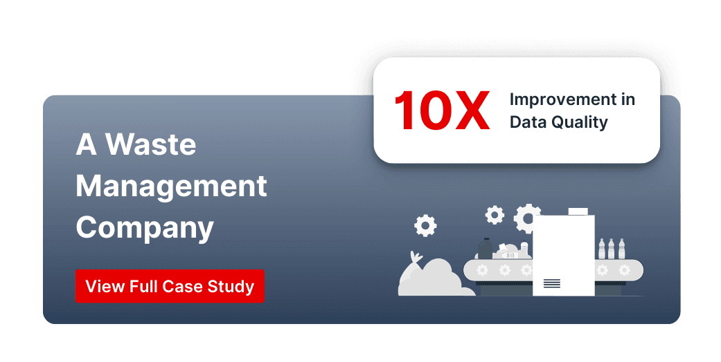
Challenge:
A leading waste management company struggled with inconsistent data from on-truck sensors and regional systems. Data duplication and missing sensor feeds created nightly data-cleaning bottlenecks and unreliable reports.
Solution with DQLabs:
By implementing DQLabs and setting up a data quality dashboard, they identified critical issues, such as duplicate records from a regional system and gaps in sensor data feeds. The data team addressed the problematic integration and improved the data collection process.
Impact:
- 10× improvement in data quality and operational efficiency
- Proactive data monitoring replaced reactive firefighting
- Increased trust in daily operational reports
- Reduced manual cleanup effort, saving time and cost
Case Study 2: Leading Community Bank
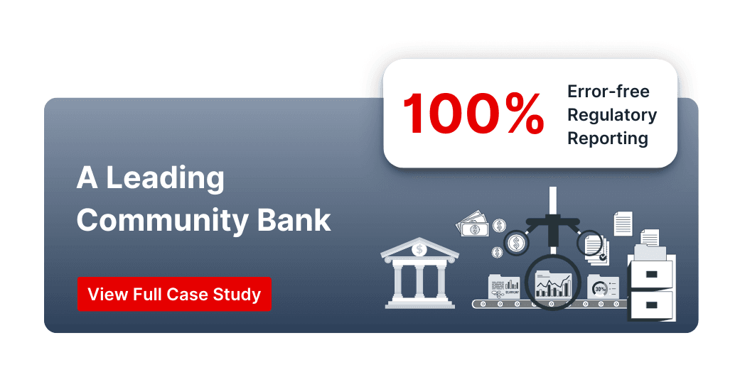
Challenge:
A Leading community bank’s data team spent hours manually finding and correcting errors in regulatory reports, risking compliance issues and delays.
Solution with DQLabs:
By using automated checks and real-time dashboards, the team was able to detect and fix issues—like missing or misclassified entries—well before the final report generation.
Impact:
- 100% error-free regulatory reporting
- Enhanced data trust across compliance and finance teams
- Faster decision-making and no last-minute reporting stress
- Strengthened confidence in financial data integrity
Conclusion
A data quality dashboard is essential for any organization committed to trustworthy data. It provides real-time insights into your data’s reliability, enabling better decisions, efficiency, and risk reduction. By tracking the right metrics, the dashboard makes data quality tangible and actionable.
It’s important to remember that implementing a data quality dashboard is not a one-off project but part of an ongoing data quality management strategy (Case Studies | Success Stories – DQLabs). It should evolve alongside your data landscape and business needs, helping foster a proactive data culture. By catching issues early and continuously improving data quality, organizations avoid fixing problems reactively.
The right technology, such as DQLabs, simplifies dashboard creation with automated checks, AI-driven anomaly detection, and pre-built dashboards. Combined with best practices, it ensures a data quality dashboard delivers real, lasting value.
Investing in data quality dashboards is an investment in trust. When teams trust the data, they can make confident decisions that lead to better business outcomes. It all begins with a clear view of your data’s quality, which a great dashboard provides.
FAQs
What is a data quality dashboard?
A data quality dashboard is a visual tool that displays key metrics related to data quality, such as accuracy, completeness, consistency, timeliness, validity, and uniqueness. It helps teams monitor data health and spot issues quickly, ensuring trustworthy data for analysis and decision-making.
Why are data quality dashboards important for businesses?
Data quality dashboards help make sure you’re working with reliable data when making decisions. They highlight issues early on, which means teams can fix them before they cause bigger problems. Dashboards also save time, help keep you compliant, and protect your valuable data.
What metrics should a data quality dashboard track?
A data quality dashboard should track metrics like accuracy, completeness, consistency, timeliness, validity, and uniqueness. These dimensions cover most data quality concerns. Depending on your needs, you can also track other metrics such as data integrity and conformity to reference data.
How do data quality dashboards differ from regular business dashboards?
Business dashboards usually track performance and outcomes, like sales revenue. Data quality dashboards, on the other hand, focus on how good the data itself is—like whether your sales numbers are accurate. They make sure the data behind business decisions is solid and trustworthy, so your team can rely on the insights.